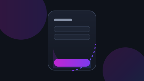
Screens grew; hands did not. On a modern phone held in one hand, a large part of the display is genuinely awkward to reach, and the top corners are the worst of it.
Put actions where the thumb already is
Primary actions belong at the bottom. The top of the screen is for information and for things you want people to touch rarely - like destructive actions.
Size targets for a thumb, not a cursor
- At least 44 by 44 points for anything tappable
- Real space between adjacent targets
- Extend the tap area beyond the visible icon
Bottom sheets beat modals
They arrive where the hand is, they are dismissible with a gesture the thumb can make, and they do not hide the context behind them.
Test it standing up
Sitting at a desk with two hands, every layout works. Test on a train, one-handed, with the other hand holding something.